Ridesharing experience in autonomous vehicles
Project type
UW HCDE Course Project supervised by Uber designer
My role
Contribution
User interview
User journey mapping
Ideation
Paper prototype
High-fidelity prototype
Interaction design
Product designer
Duration
Tools
Sketch
Marvel
Principle
10 weeks for course project
10 weeks for redesign
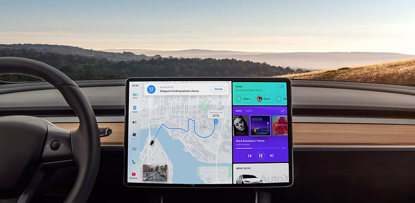
OVERVIEW
Background
“Self-driving cars are the natural extension of active safety and obviously something we should do.”
---Elon Musk, Founder of Tesla
“The vehicles will be self-driving. So you have your own person space where you can sit back and relax.”
---John Krafcik, CEO of Waymo
The era of fully autonomous cars is coming soon. With this trend, new questions arise regarding the implications on rideshare companies. Big companies like Uber and Waymo are designing their own self-driving cars. Imagine one day you can request autonomous car on the ridesharing app. So we want to explore:
How will the user experience of rideshare change with self-driving technology?
Product preview

Request AutoX
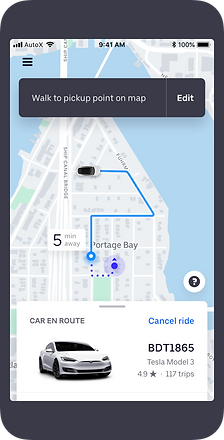
Wait for the car

Find the car

Unlock the car
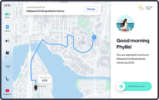
Start the ride with in-vehicle dashboard
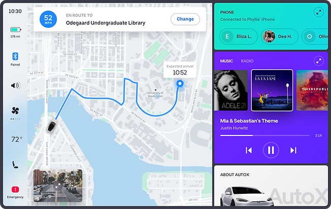
On trip
RESEARCH
Secondary research
We started with secondary research on autonomous cars and rideshare apps such as Uber and Lyft. We also took a look at Waymo's first self-riving car. In order to complete a full user flow, from requesting a ride to ending the trip, 3 out of 5 major steps require evolvement of drivers, which led us to think of how to ensure a safe and smooth user flow without a driver.

(Picture is from Uber official website)
Interview & questionnaire
We have sent out 100 online questionnaires and got 96 responses. 60% of participants have experienced difficulty in finding the car, and over half of them thought it negatively affect the ride if they cannot find the drivers. When asked about riding with autonomous cars, 90% of participants expressed concerns on safety and how to find the car when there is no human driver, as well as how to interact with the car during the ride.
Reframe design question
The above findings helped us further narrow down our problem statement, so we came up with our final design question:
How might we improve the pick-up and riding experience for riders with self-driving cars?
DESIGN ITERATION
Ideation
We brainstormed and decided that we would need to have two components as part of our overall solution:
01
A mobile app that would provide users additional ways to track and locate their cars during pickup.
02
A car dashboard which in the absence of a driver, users would use to communicate before and during their rides.

Concept validation - Guerilla user testing
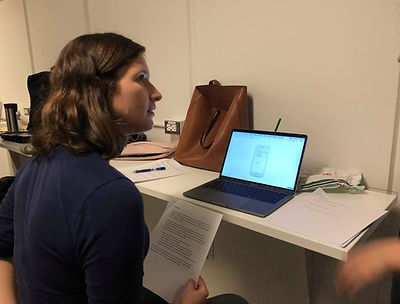
We performed Guerrilla usability testing (see rubrics) with 5 users on paper prototype using Marvel and got some great feedback related to application visibility and user efficiency:
“I want to have control on locking and unlocking the car.”
“I am not sure where the call and text would go to, and not sure about 3D means here.”
“Wait time of 2 mins is very short, could it be longer?”
“Honking sound is a good way for me to locate the car."
"I am worried that I would hit the emergency or stop button by accident."
Final solution
We started designing high fidelity prototypes by creating a style guide for the user interface and determining major screens of the app. We used Sketch for UI design and Principle for motion design. Visual design was inspired by Uber and Tesla, while we focus more on features for pickup and riding experience.
Let us walk you through our design solutions by Phyllis' journey.
Scenario 01
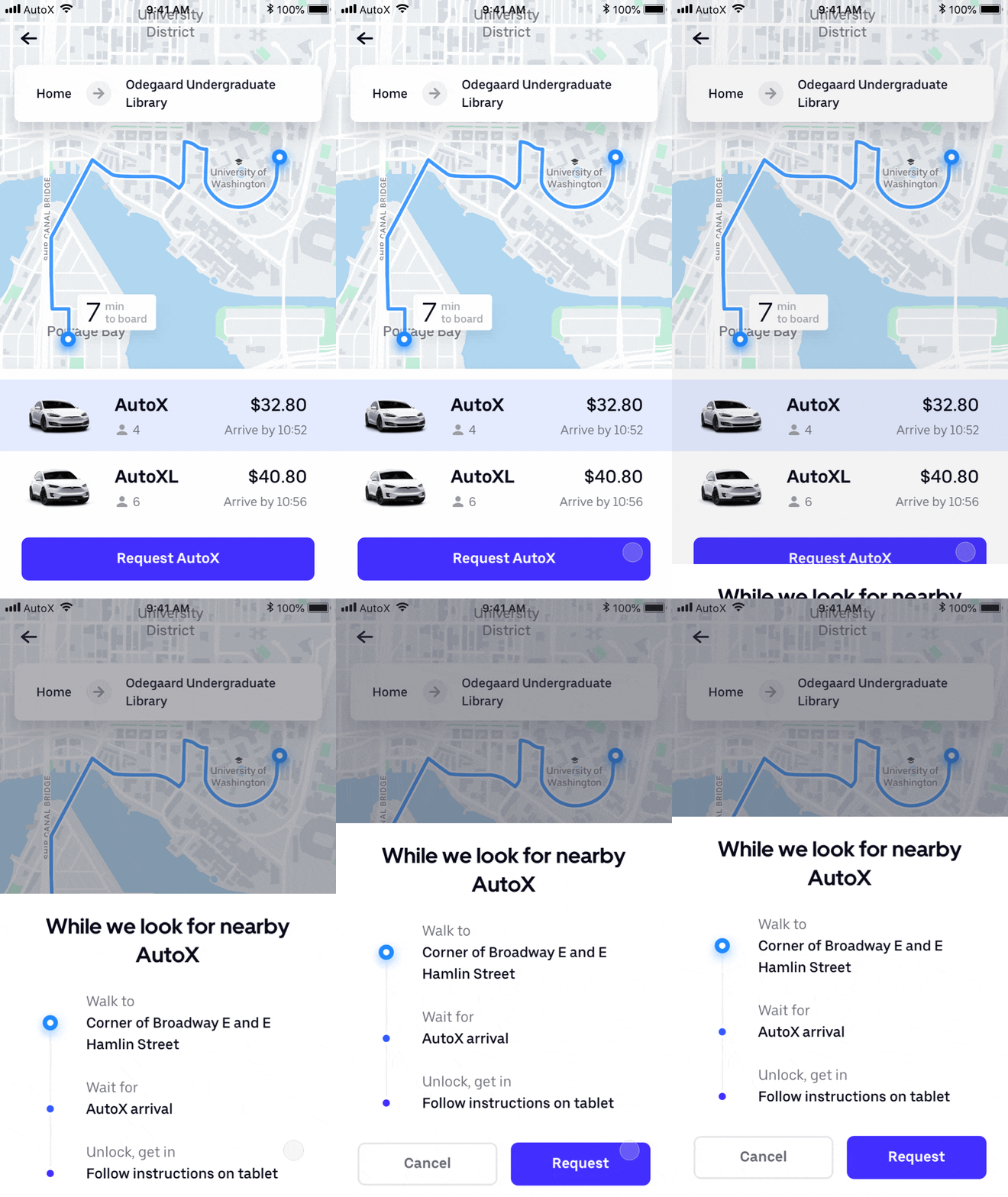
Phyllis wants to get a car on Uber to take her to Odegaard Undergraduate Library, and she decides to try AutoX, the self-driving car.

Task 1
Request AutoX for the first time
Key Feature
Information screen for new users
Justification
-
90% of participants expressed concerns over safety (questionnaire), information screen would enable users to double confirm their pickup location and give then safety tips.
-
Participants said they want more information when they try new products (interview).

Task 2
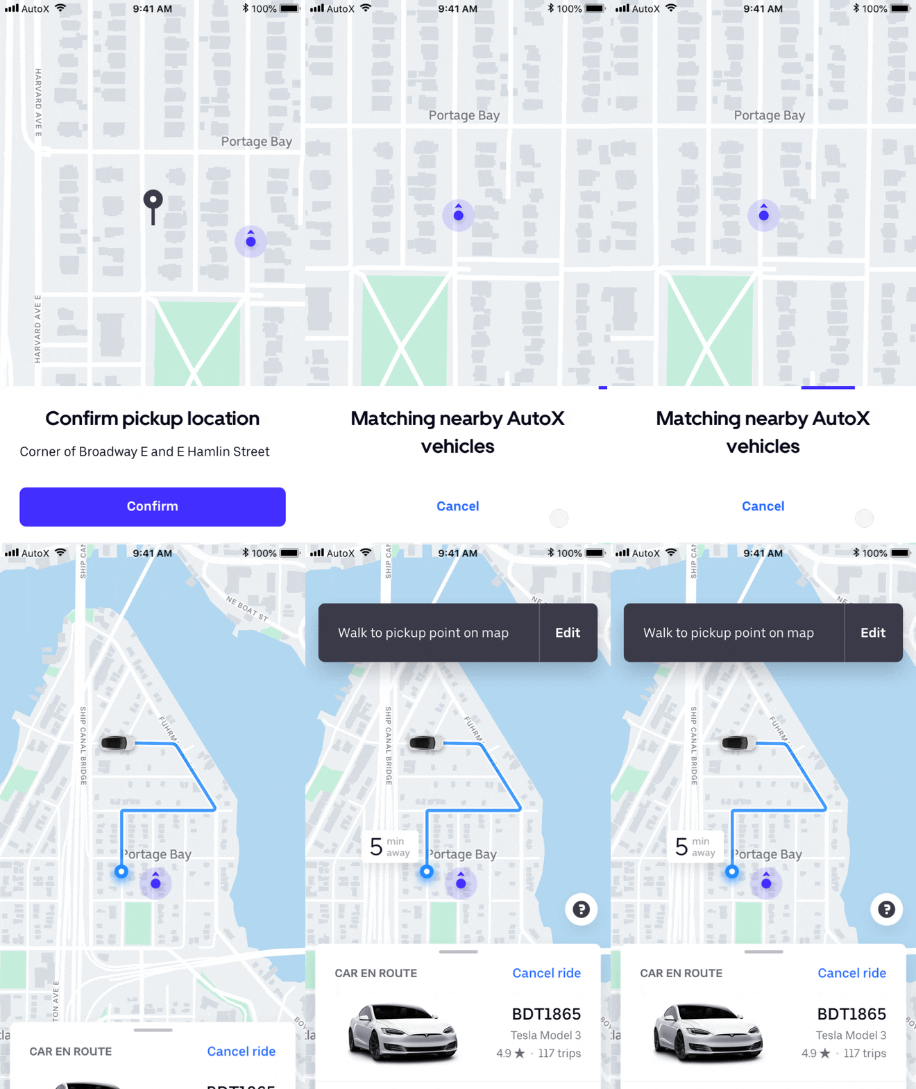
Confirm pickup

Task 3
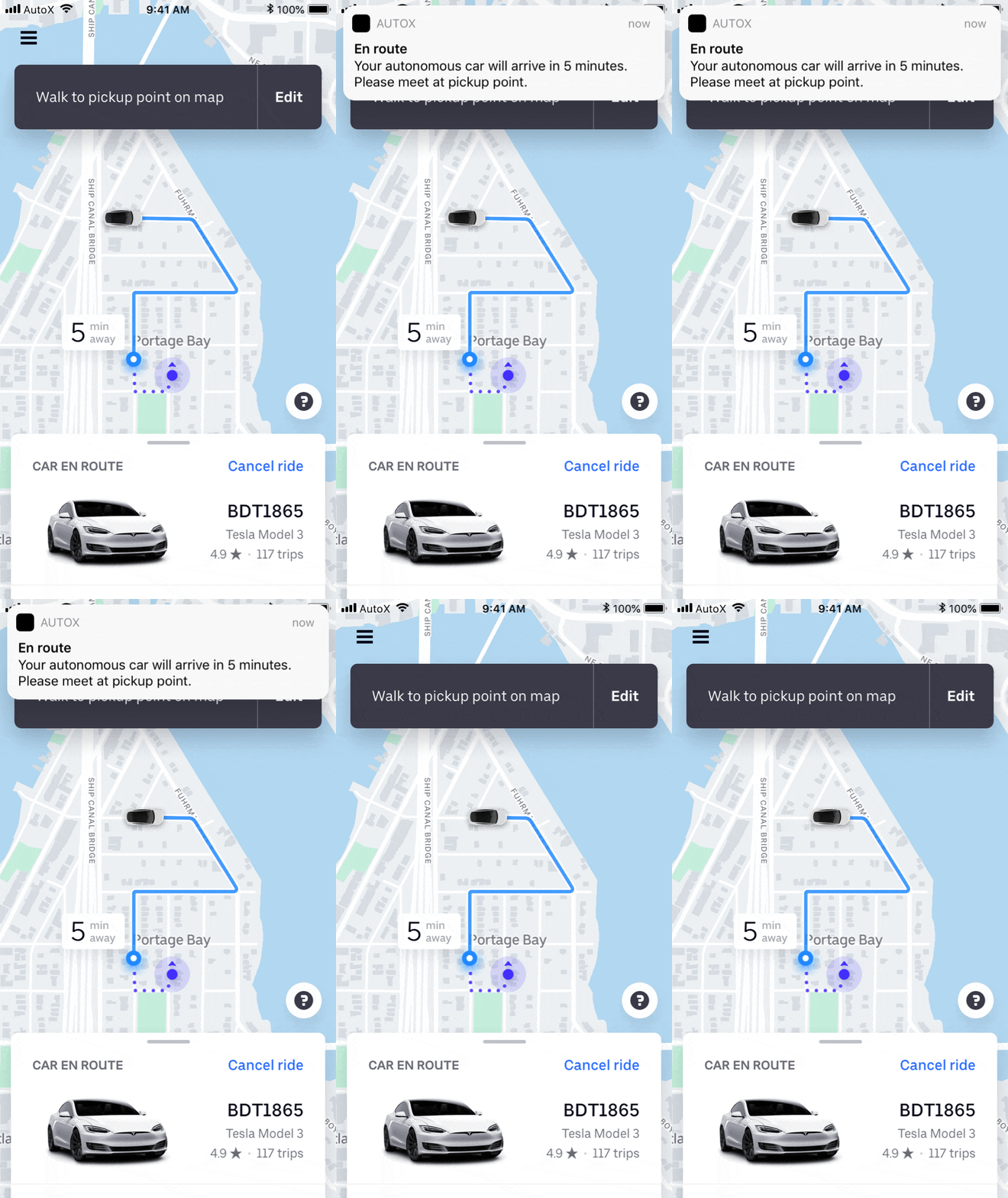
Wait for the car
Key Feature
Push notification
Justification
Push notifications allow users to get multiple notice about the car they requested even of they don’t check the app (secondary research).
Scenario 02
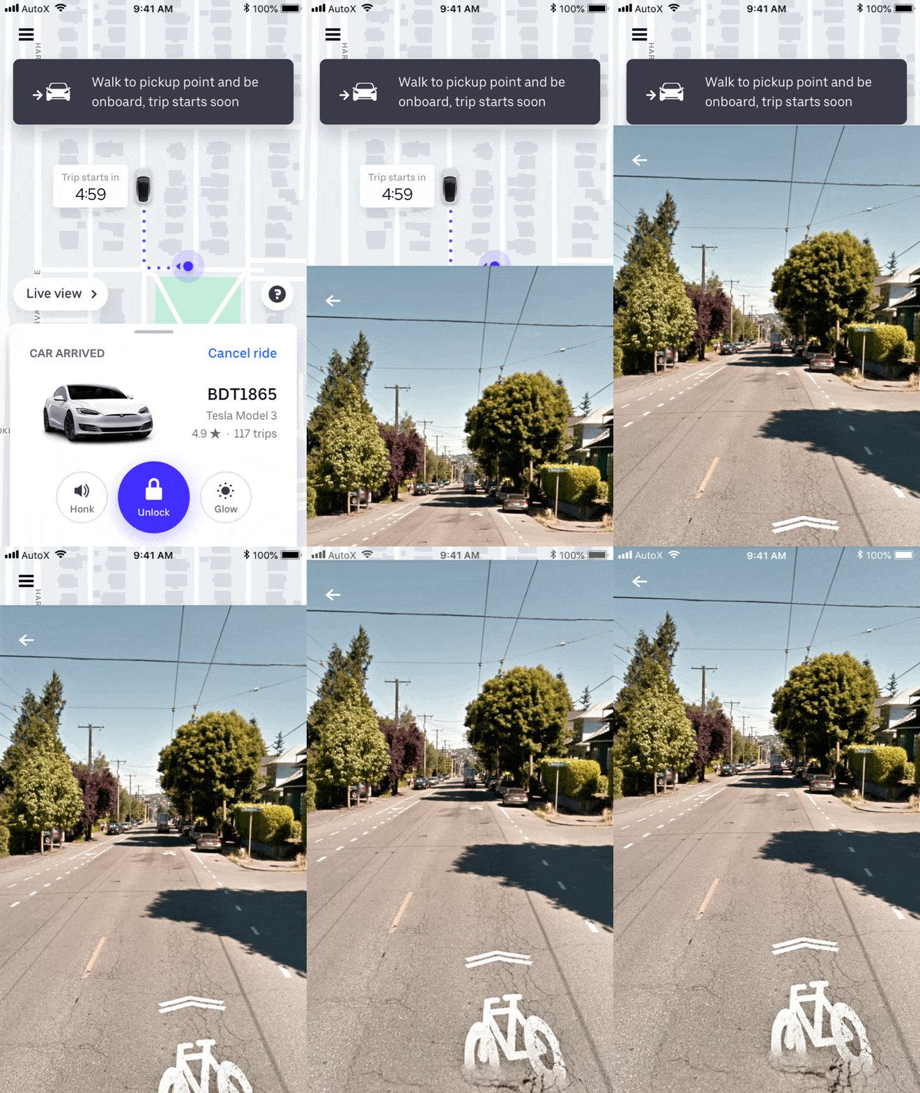
The app shows the car has arrived, since there is no driver to call or text, Phyllis is trying to use the in-app features to find the car and then unlock it.

Task 4
Find the car
Key Feature
Honk sound and live view for locating the car
Justification
-
4 out 5 participants thought 3D street view would be helpful since they can have a better sense of where the car is through its surroundings (usability testing).
-
Using the honk sound button on car key is one the most common way to find the car (secondary research).

Task 5
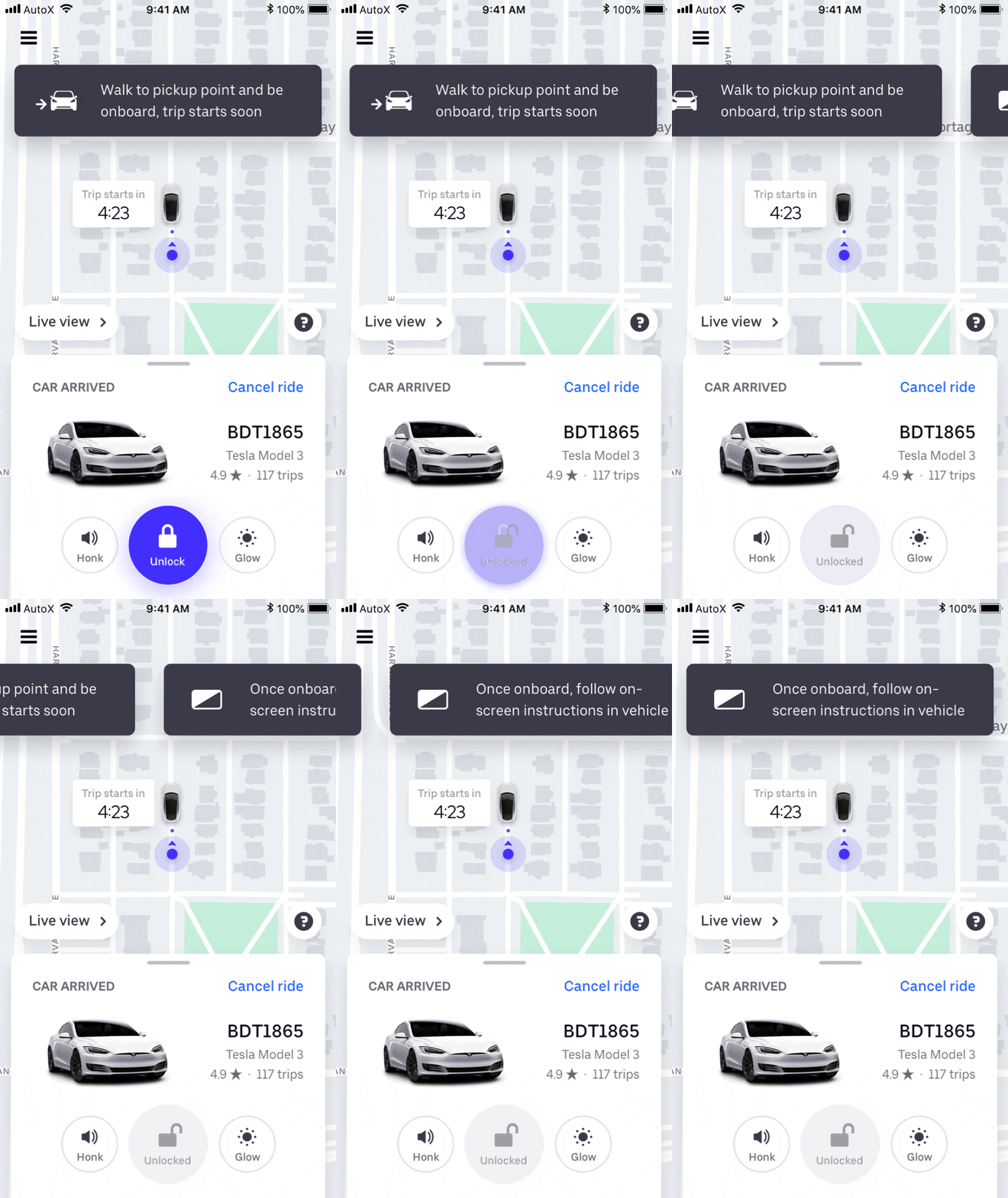
Unlock the car
Key Feature
In-app unlock button
Justification
-
Over 90% of participants expressed safety concerns for ridesharing with autonomous cars, such as people break into their car, so adding a button which functions as car key is reasonable (questionnaire).
-
5 out of 5 participants would want more control for their ride (usability testing).
Scenario 03
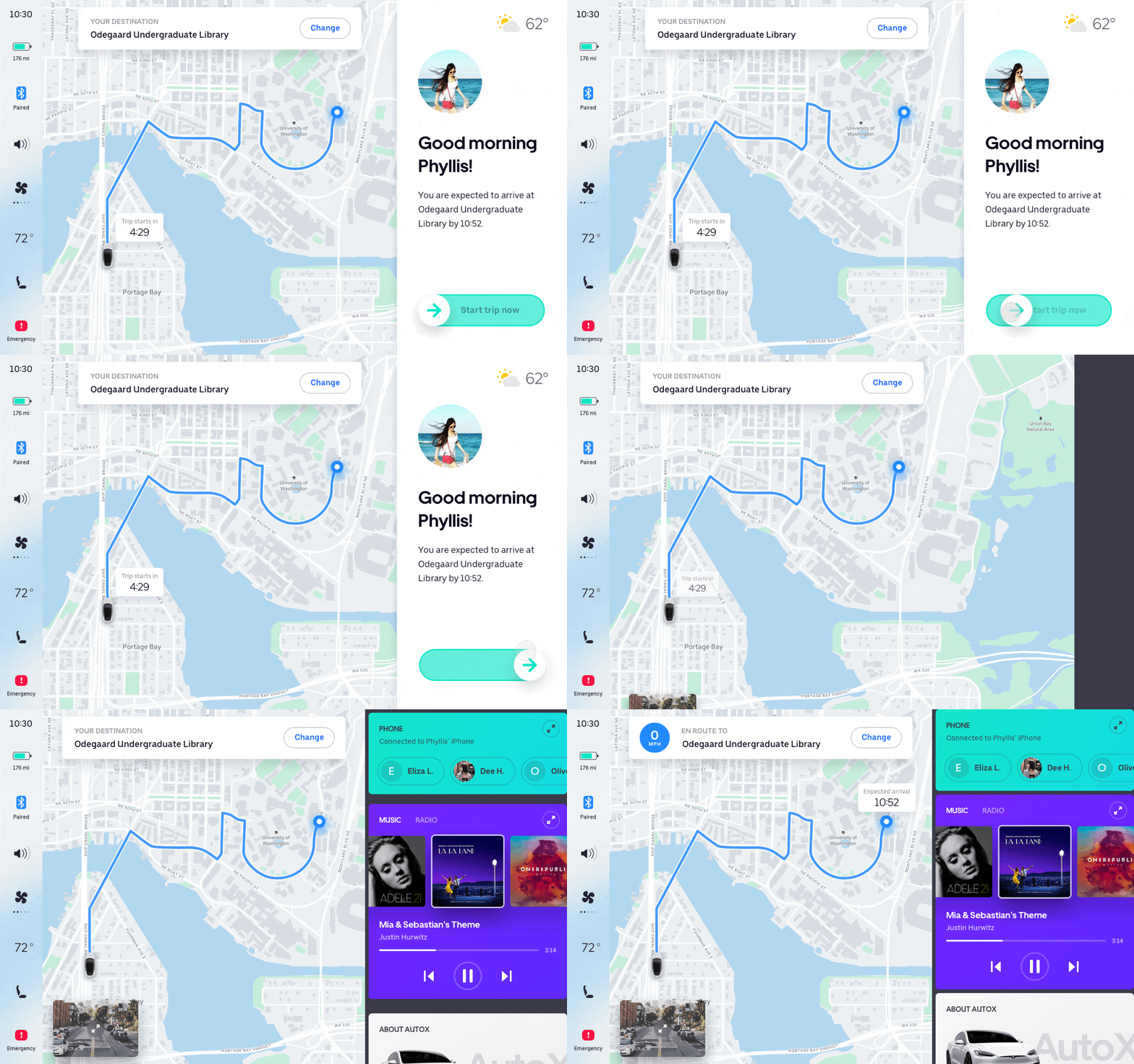
Now Phyllis is in the car, but she has coffee at her hand and doesn't want the car to start immediately before shutting the door, fastening the safe belt, and putting her coffee in place. The in-car dashboard allows her to start the ride manually, and provides the real-time route information. She can also change the destination if she wants to go to another place.

Task 6
Start the ride
Key Feature
Slide to start the trip
Justification
-
People need time to shut the door, fasten the safe belt and put personal belongings in place after they jump into the car, so 4 out 5 people wouldn’t want the car to start immediately and automatically (usability testing).
-
Drivers need to confirm manually when the riders get onboard, but since the autonomous car has no human driver, riders need to confirm the ride by themselves (interview).

Task 7
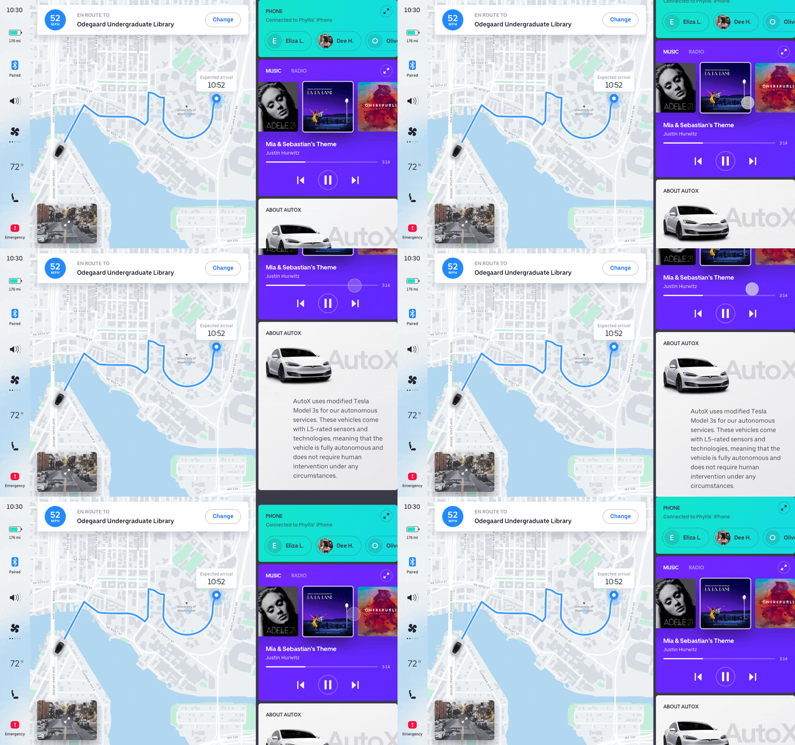
Change destination or stop riding if needed
Key Feature #1
Change destination
Justification
-
25% of the participants have changed their destination during the trip using Uber or Lyft, while 50% of them don’t even know they could do it in the app (questionnaire).
-
Changing destination would give people more control over the ride (usability testing).
Key Feature #2
Stop the car or contact 911 in case of emergency
Justification
Under extreme cases such as car accident or riot, users should be able to stop the car or call the police (interview).
MAJOR CONSIDERATIONS
Keep a narrow scope
(TL;DR)
In the very beginning of the project, we have done a lot of research on autonomous cars such as 5 levels of autonomous driving, and read news about Waymo’s and Uber’s testing on their autonomous cars. We realized the technology is still not yet mature and face much controversy. Our participants raised concerns and questions on technical feasibility as well. As a school project without any actual support, we decide to focus only on how to solve the pain points of finding the car and starting the ride when there is no driver. Therefore, technical feasibility is not considered a major issue here and the assumption is that the autonomous car used for ridesharing has already achieved level 5 of automation.
While mapping the user’ journey, we found the drop-off experience is also important: How to ensure riders get off the car when the trip ends? What if people keep staying on the car?However, due to time constraint, we didn’t add drop-off in our product flow. Prioritizing the tasks and allocating the efforts efficiently are essential for project management. Knowing what not to do is equally important to knowing what to do in a limited amount of time.


Minimize impact of user errors
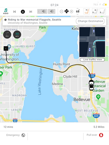
When testing our paper prototype, 2 out of 5 participants asked what if they hit “Request stop” button by accident, and they also wondered if the car would pull over or stop in the middle of the road. To avoid confusion, we changed “Request stop” button into “Pull over”, and add “Emergency” button which enables user to call 911.
.png)
First iteration of high-fidelity prototype of car dashboard
However, both buttons are likely to be hit by accident, and stopping in the middle of the traffic would be dangerous for both riders and other cars on the road. To address this issue, we combine “Pull over” and “Emergency” buttons into one, and after tapping this button: 3 options would pop up: Immediate Stop, Poll over, and Call 911. Therefore, users would need an extra tap if they want to stop the car immediately, terminate the ride or contact police for emergency.
TAKEAWAYS AND NEXT STEPS
Takeaways
-
Communication: Always keep all group members on the same page. Collaboration wise, I had thought that the best scenario would be every team member has their own portion of work and take responsibility for that. But when I finished the paper prototype, one of our group member got super confused on some of my design decisions, and I missed the second usability testing so it took a while to figure out where I need to make changes. If I can do the project again, I will definitely jump out of my comfort zone and get to know what others are doing, and of course, ask questions.
-
Design: Design system matters! We started working on sketch without a design system, and didn’t expect there are so many screens, and very quickly we notice some inconsistency, since when we made changes on a screen, we sometimes forgot to change other screens accordingly. After learning the concept of atomic design, we realized the importance of defining a design system before hand. In my later design work, I would leverage the existing design system like Material design or Polaris, or made one on my own.
-
Prioritization: Knowing what not to do is equally important to knowing what to do in a limited amount of time. The minimal viable product or our first baby might not be perfect in features, but we can keep iterating and plan future steps.
Next steps
-
Design drop-off experience to make a complete ridesharing experience
-
Involve more stakeholders for research, testing and design phases
-
Explore and design more solutions to ensure a safety ride
-
Enable multi-modality, such VUI (Voice User Interface)
STATEMENT AND ACKNOWLEDGEMENTS
This project originated from the course project at University of Washington, under the supervision of Daniella Kim, the lecturer for User-Centered Design. The original research and design was done together as a group: Saurya Sinha and I drew the paper prototype and high-fidelity interface, while Connor O'Toole took care of research and documentation. We did a final presentation when the course ended (find design specification ). However, I revamped the interface design including color scheme, typography, layout, icon set and some of the features based on research results and visual hierarchy principles, and added the animation which is not a part of the course project. Altogether I made 5 iterations before I came to all design decisions for this portfolio piece.
Here are the original final design solutions for the group project, including mobile app and car infotainment system:

Specially thanks to Yao Liu (Senior Designer of Duolingo) for your feedbacks on user interface and interaction pattern, to Jose Torre (Former Head of Design of TomTom) for your suggestions on interaction flow, and to Gary Andersen(Sr. Design Manager of Microsoft) for your suggestions on portfolio content, visual hierarchy and accessibility issues.

